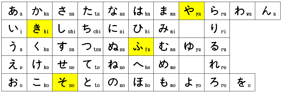
Here we have reproduced five of the same hiragana syllabary sets. Each time we chose a different font, so as to show you what different styles of handwriting look like.


The first two are clearly designed for children. They are straightforward and do not have too many added flicks. Closely compare the yellow kana boxes and you can see the differences.
The next one is similar, but showing a different style. It is more compact and ‘so’ and ‘fu’ are in the most original form with separate dots, yet ‘ki’ is still joined.
The next one is already showing more curves and more flicks. It is more adult-like and more stylish (a matter of taste).

The last one clearly is a style of writing that an adult would aspire to. The added flicks make the handwriting more flowing and also show that older people tend to not lift their pen or brush as they keep writing by linking every word. It is obviously not a problem, if you are an experienced reader, but children find it stressful having to “read grandma’s handwriting”.

We suspect that is the case in all languages and types of writing. Of course, here we have shown only hiragana, but if one adds kanji to it, it becomes really difficult to read for youngsters.
The most advanced forms of handwriting styles are called calligraphy. It is very difficult and one has to train for that. It has become an art form all of its own.
